PURE / Expert Review
Immerse yourself in our comprehensive guide on heuristic evaluations and PURE reviews to refine your UX skills. This resource takes you from understanding the core principles of usability testing to actively applying them with our adaptable templates. Improve your designs, save time, and make your user's life easy.
PURE
Definitions
Heuristic Evaluation
A heuristic evaluation or expert review is a type of study where a usability expert uses his/her knowledge and experience of testing websites with users to walk through a website with the goal of uncovering potential usability issues with a product from the perspective of a target user. Once the expert identifies the problems, then recommends changes to improve usability. This happens in two scenarios:
- When budgets and timescales don’t allow for user research.
- As a first step to validate issues with real users.
There are many frameworks to get started with a heuristic evaluation:
- Nielsen’s 10 usability heuristics
- ISO’s 7 dialogue principles
- Shniederman’s 8 golden rules of dialog design
- Gerhardt-Powals’ 10 cognitive engineering principles for enhancing human-computer performance
- Tog’s 16 principles of interaction design
- Weinschenk and Barker classification
- Cognitive Walkthrough
The template has been adapted to use the Cognitive Walkthrough and Nielsen's 10 usability heuristics, however you can adapt it to the framework you are most familiar with.
PURE
At its core PURE is a lightweight implementation of the frameworks above that helps UX practitioners perform heuristic reviews.
Pure stands for Pragmatic Usability Rating by Experts, and it is a method devised by Christian Rohrer and Jeff Sauro et. al. in this publication:
 Practical Usability Rating by Experts (PURE) | Proceedings of the 2016 CHI Conference Extended Abstracts on Human Factors in Computing Systems Usability testing has long been considered a gold standard in evaluating the ease of use of software and websites-producing metrics to benchmark the experience and identifying areas for improvement.
View →
Practical Usability Rating by Experts (PURE) | Proceedings of the 2016 CHI Conference Extended Abstracts on Human Factors in Computing Systems Usability testing has long been considered a gold standard in evaluating the ease of use of software and websites-producing metrics to benchmark the experience and identifying areas for improvement.
View →
PURE
A free article can be found in the link below:
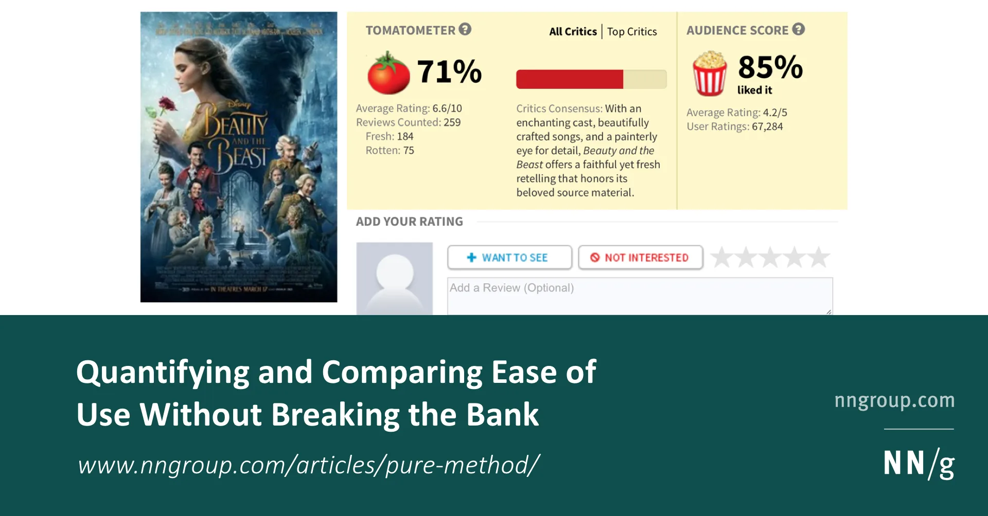 Quantifying and Comparing Ease of Use Without Breaking the Bank The PURE method quantifies how difficult a product is to use and provides qualitative insights into how to fix it, both without costing a lot of time or money.
View →
Quantifying and Comparing Ease of Use Without Breaking the Bank The PURE method quantifies how difficult a product is to use and provides qualitative insights into how to fix it, both without costing a lot of time or money.
View →
Both articles are worth the read and were used as the foundation of this template.
PURE
Template
I have used this template to do the Heuristic Evaluation at News Corp for a product they had. And since then I have also used as part of my Mentoring program with junior UXers.
Definitions
As discussed in the articles above. PURE requires you to assess all different steps to perform a given task with a range of 3 values:
PURE
For example:
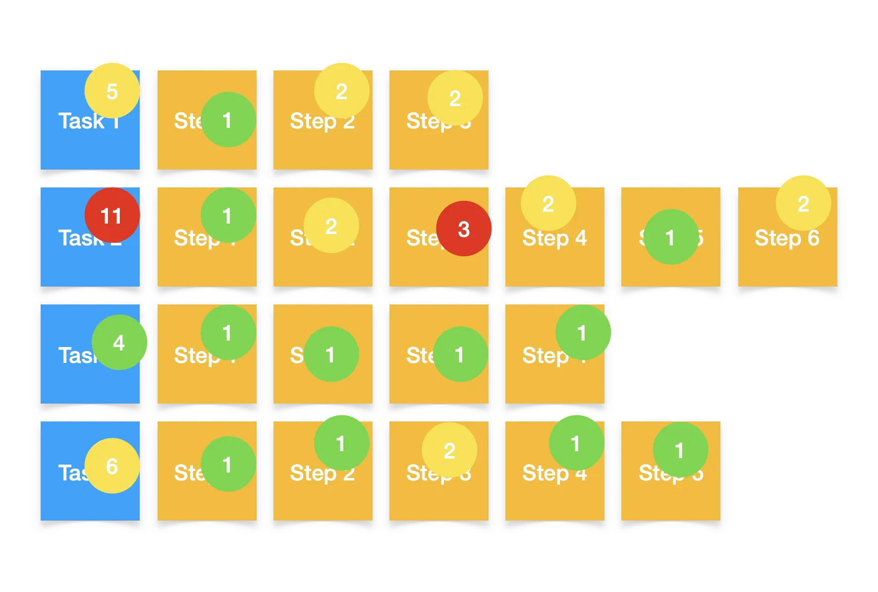
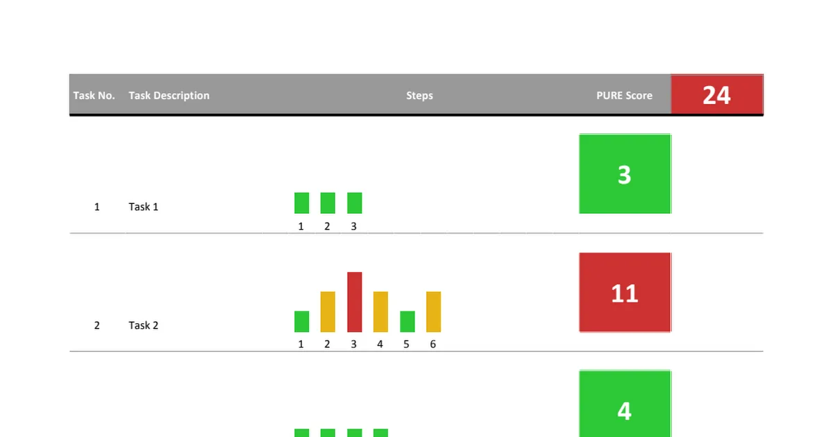
A hypothetical software has 4 different tasks that can be performed in it. Task 1 has 3 Steps; Task 2, 5 Steps; Task 3, 4 Steps and Task 4, 5 Steps.
Each of the steps are assigned a value based on the criteria above.
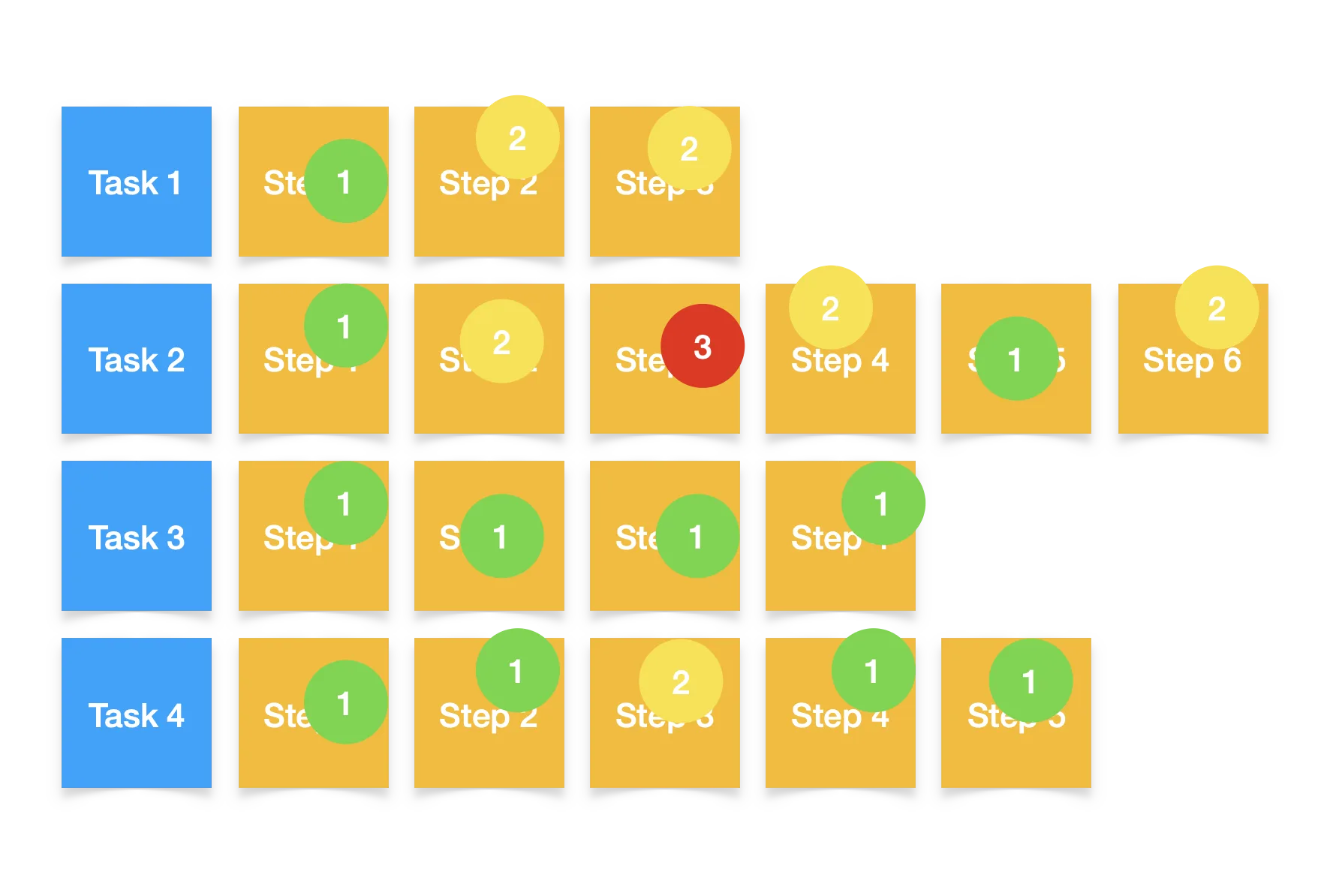
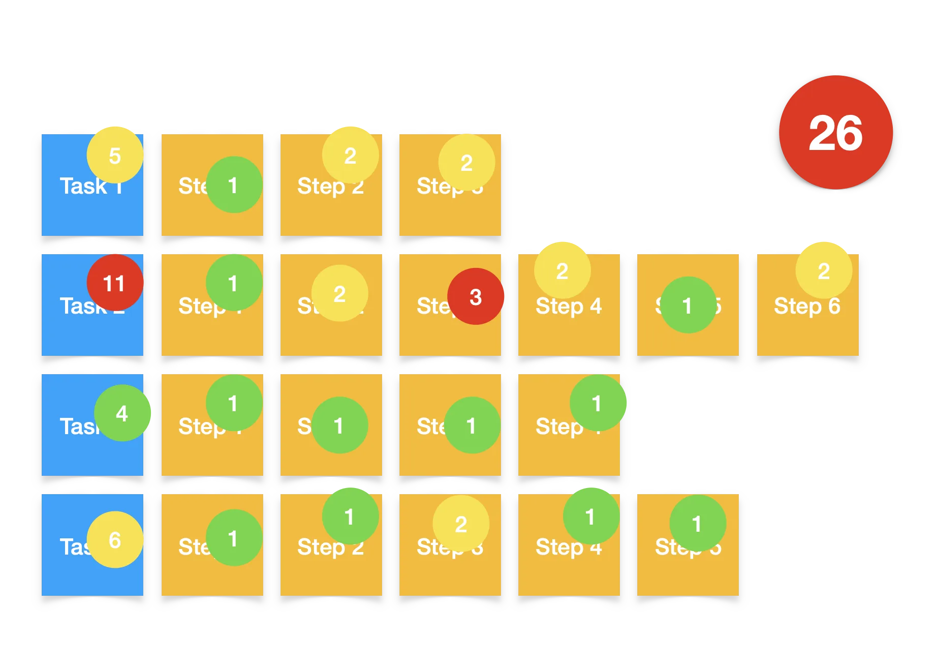
The sum of all the values then goes to the task, with the most frictionful task providing the colour:
Then the system as a whole receives a score based on the sum of the friction of all the tasks and the most frictionful task providing the overall colour.
The template provided in this article then provides you with a dashboard that handles all colours and additions by using the values provided to the tasks.
PURE
Template in Action
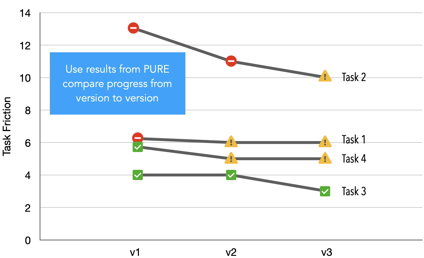
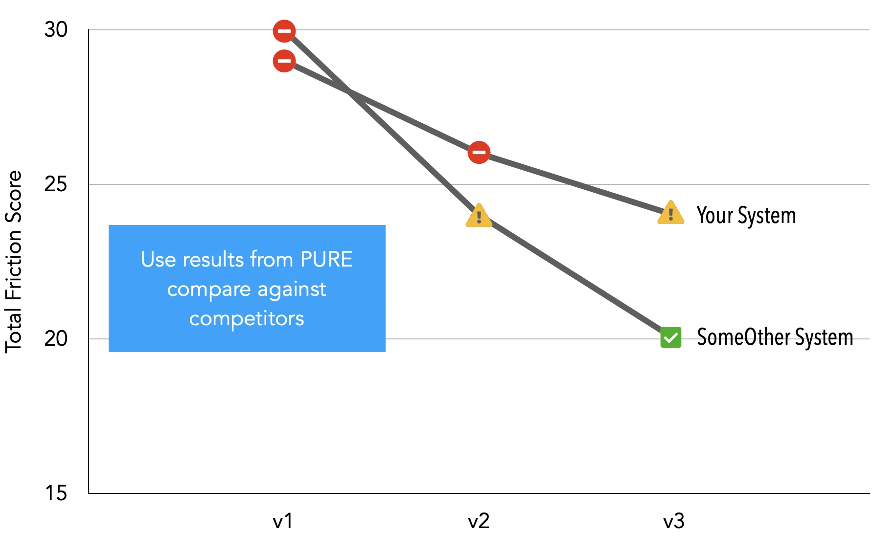
Results from the dashboard then can be used to track:
- System evolution through time
- System performance against competitors in the same space
So far we have explained how a PURE review works. But the real magic of this template is only possible from its structure, which is explained below.
Template Structure
And as discussed, before filling up the template make sure that you have:
- Identified and prioritised the key tasks that are preformed by your users in the golden path.
- Split those tasks into steps as intended originally by the design team.
- Adapt the task list in the Evaluation sheet to reflect the tasks and steps that can be performed in the system.
The file has two sheets:
- PURE Dashboard – Almost read only. It draws all the values from the Evaluation sheet.
- Evaluation – page where you input all the values.
So how does it work? You just need to fill the evaluation sheet, using some of the prompts.
Evaluation sheet columns A to E:

- Task No | Task Number. Fill it with numbers (integers). You can add and remove numbers as long as they are ordered consecutively from top to bottom. A task has multiple steps.
- Step No | Step Number. Fill it with numbers (integers). You can add extra steps per task as long as they are ordered consecutively from top to bottom.
- TS | Task-Step Id. Read Only – This is used by the sheet to update the dashboard. For it to work properly, both Task Number and Step Number columns need to have numbers.
- Step Description | Step Description. Optional – Fill it with text. A note describing the step being assessed.
- Grade | Grade. – A number from 1 to 3 describing the friction level as defined above.
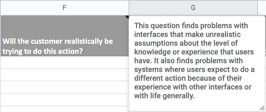
Evaluation sheet columns F to I – Cognitive Walkthrough:

When in doubt you can easily just hover the cells and get the description of what to look for.
PURE
For more insights on where all this comes from, make sure to look at this article by David Travis on how to perform a cognitive walkthrough.
 The 4 questions to ask in a cognitive walkthrough Although the cognitive walkthrough gets less coverage than Nielsen's heuristic evaluation, it's just as effective at uncovering interaction problems.
View →
The 4 questions to ask in a cognitive walkthrough Although the cognitive walkthrough gets less coverage than Nielsen's heuristic evaluation, it's just as effective at uncovering interaction problems.
View →
PURE
Evaluation sheet columns J to S – Heuristic Evaluation:
These columns prompt the user to perform a Heuristic Evaluation with Jakob Nielsen's 10 Heuristics.

You can see an article with the 10 heuristics in the link below.
 10 Usability Heuristics for User Interface Design Jakob Nielsen's 10 general principles for interaction design. They are called "heuristics" because they are broad rules of thumb and not specific usability guidelines.
View →
10 Usability Heuristics for User Interface Design Jakob Nielsen's 10 general principles for interaction design. They are called "heuristics" because they are broad rules of thumb and not specific usability guidelines.
View →
PURE
PURE
Template Example
The following template was filled by a study group I lead. The point of the exercise was to look at how the application Headspace could be improved at the time of performing 4 tasks.
- Sign-up + Log in
- Doing first Meditation
- Exploring Meditations
- Switching between meditations
PURE
As you can see, Headspace has some work to do in its app.
DOWNLOADS